Kenes Studio — Creative Design Studio
Kenes Studio is a creative design studio crafting brand identities, packaging, and motion design that help ambitious brands stand out and win customers.
We turn founders' visions into remarkable brands by combining strategy, design, and craft, all under one roof.
Explore our work.
Studio philosophy
A simple philosophy: quality over quantity.
We partner with a select number of clients each year to deliver unmatched focus and impact. Every detail is carefully crafted, every decision is strategic, and every outcome moves your business forward.
Performance & emotion. You need both.
We craft brands that become category leaders. Great products alone don't get you there — emotional connection and sustainable growth do. That's how brands earn loyalty, retention, and advocacy.
What we do
Strategy, Design, Craft.
Independent Brand & Design Studio.
Branding, packaging, print design, and illustration.
Selected works
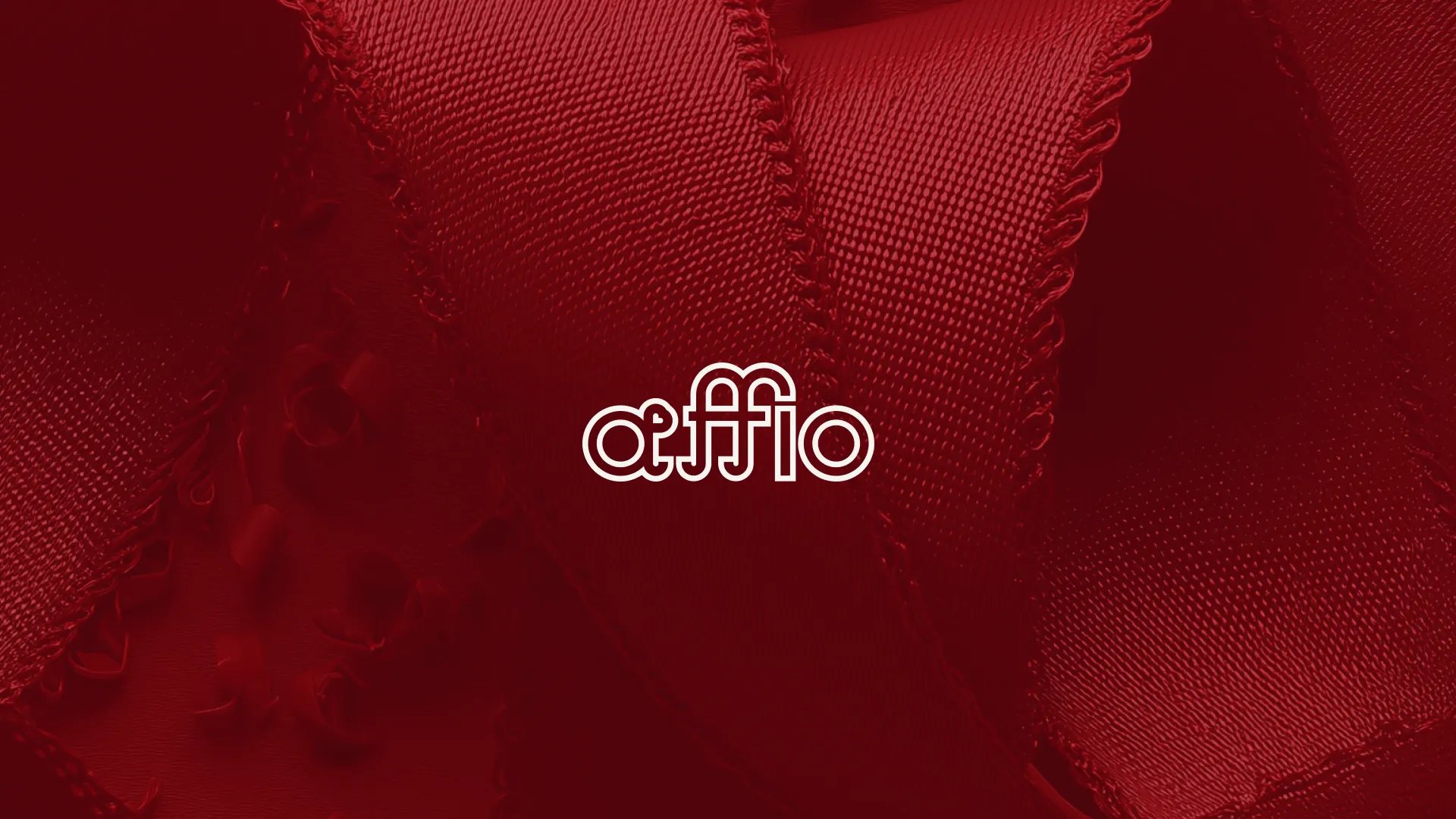
Affio — Brand Identity (2025)
A complete brand identity system with logo animations, visual language, and motion assets built for a modern corporate presence.
Services: Brand Identity, Motion Design, Art Direction
Affio is a gift curation studio — and gifting is a purely emotional purchase, so the brand has to feel like the gift itself. We designed the identity end to end: a refined logotype, a warm premium palette, packaging, social templates, and animated logo moments that make every touchpoint feel personal and considered. This is the kind of system that builds trust before a single word is read.
The Problem
Gifting is emotional — and Affio's previous identity felt generic. Without a cohesive system, the studio couldn't communicate warmth or craftsmanship across packaging, social, and digital, and struggled to stand out in a crowded lifestyle market.
The Approach
We positioned Affio as a thoughtful premium gift studio: personal without being decorative. Audience, competitors, and existing touchpoints shaped a direction rooted in care, elegance, and clarity.
The Solution
A complete identity — logo, palette, typography, packaging rules, and social templates — that makes every curated gift feel intentional. The brand now sells the emotional value before a single product is opened.
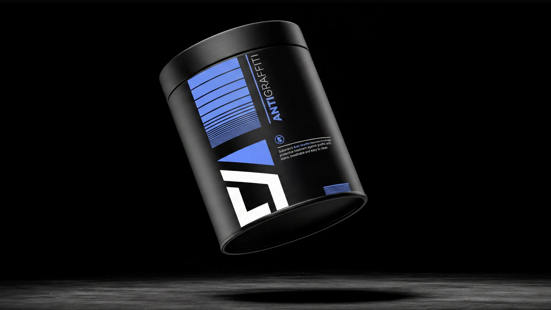
Suberlev — Brand Identity (2025)
Corporate brand development with animated identity elements, digital applications, and a cohesive visual system across touchpoints.
Services: Brand Identity, Motion Design, Creative Systems
Suberlev is a business-services company that needed to look as established as its expertise. We rebuilt the brand around a precise mark, structured typography, and a motion language that carries the identity across presentations, digital products, and social — one coherent system instead of scattered graphics. The result is a brand clients take seriously from first contact.
The Problem
Suberlev's expertise was stronger than its look. Logo, animation, and supporting graphics felt disconnected — which made a capable company appear less established than it is.
The Approach
We mapped services, audience expectations, and competitors to build a system that balances corporate clarity with motion-led energy — scalable from static lockups to animated moments.
The Solution
A refined mark, structured typography, and a motion language that work across presentations, digital products, and social. Clients take the brand seriously from first contact.
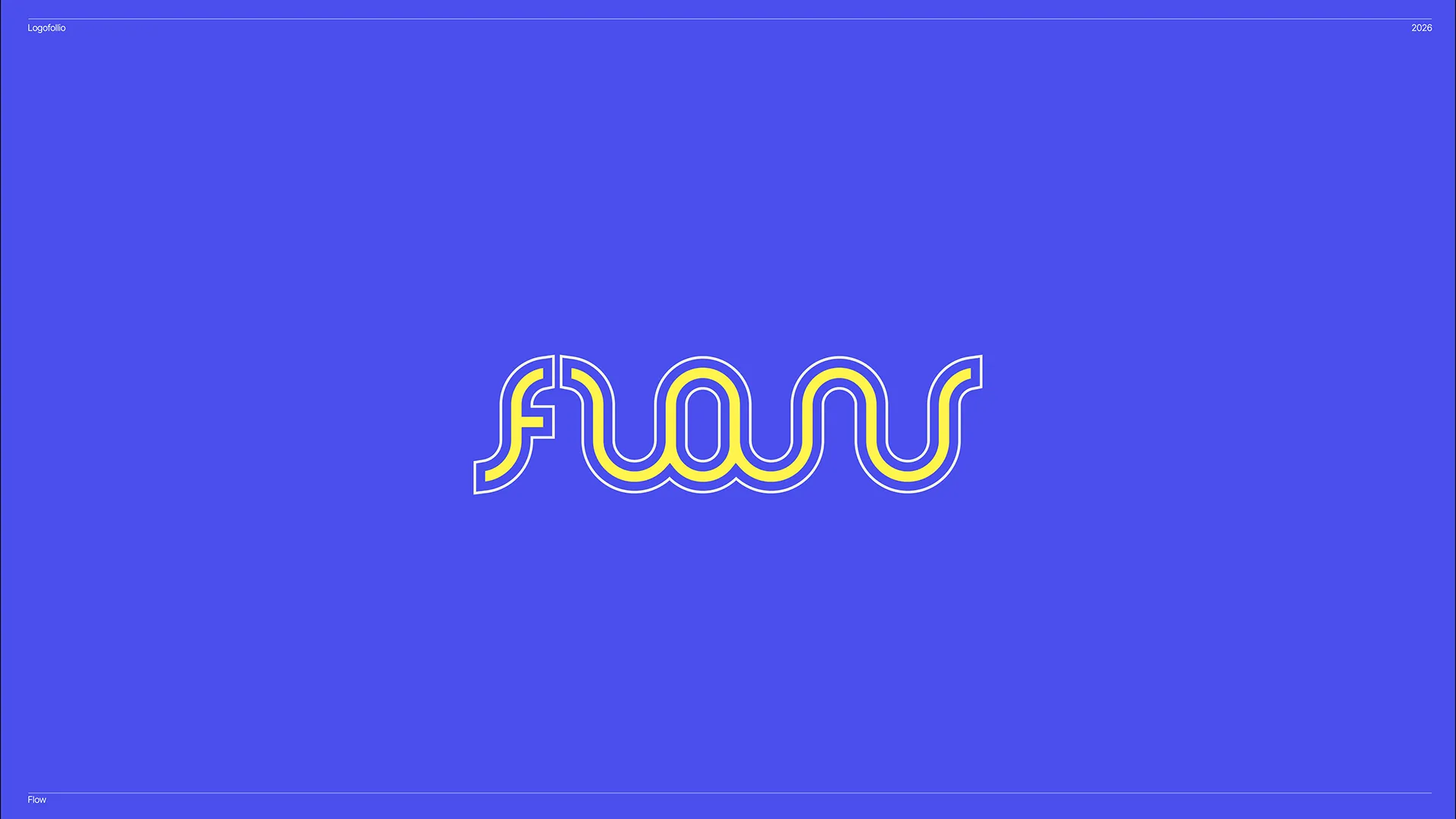
Logofolio — Logo Design (2025)
A curated collection of logo marks and identity explorations — precision-crafted symbols built for clarity, recognition, and scale.
Services: Logo Design, Brand Identity, Visual Systems
A logo is the hardest-working asset a brand owns: it has to be recognized in a split second, at any size, on any surface. Logofolio is our curated collection of marks built on disciplined geometry, negative space, and typographic craft — across very different industries, with the same level of rigor. If you want a symbol your customers will actually remember, this is how we think.
The Problem
Each mark needed to communicate a distinct personality while sharing a consistent level of craft. The collection had to feel editorial and intentional, not like a random assortment of unrelated concepts.
The Approach
We treated each logo as a standalone system — exploring form, negative space, and typographic pairing before refining the mark for real-world use.
Consistency came from disciplined geometry, restrained palettes, and repeatable construction logic rather than a single visual template.
The Solution
The result is a portfolio of versatile logo marks that demonstrate range without sacrificing cohesion.
From minimal wordmarks to symbolic identities, each piece is built to remain legible, memorable, and adaptable at any scale.
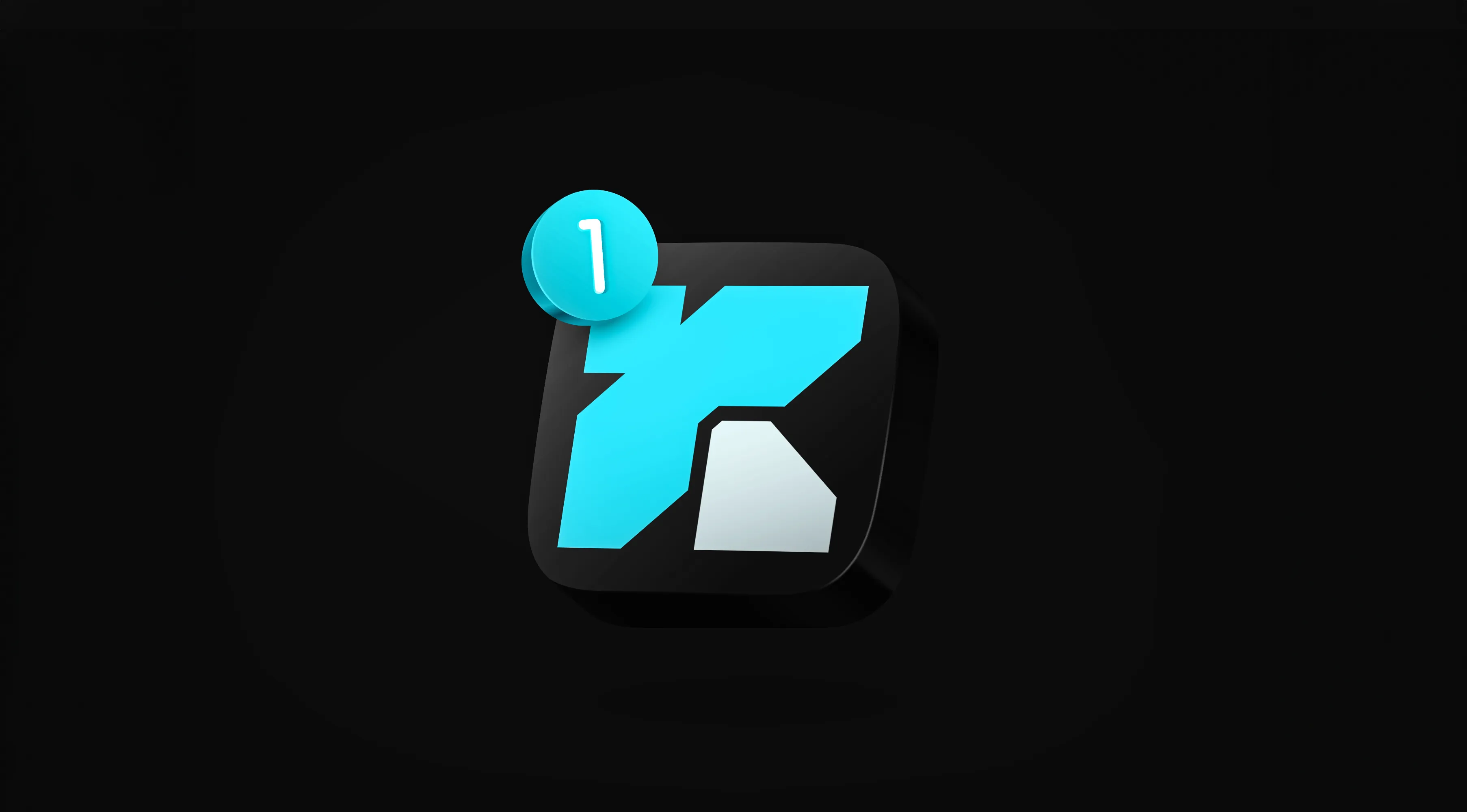
Koru — Brand Identity (2025)
End-to-end brand identity with motion systems, app UI animation, billboard concepts, and a full suite of animated logo treatments.
Services: Brand Identity, Motion Design, UI Animation
Koru is a technology brand where motion isn't decoration — it's the identity itself. We designed the full system: animated logo behaviors, app UI motion, display and billboard concepts, all driven by one kinetic logic that holds up in light and dark environments alike. For a digital product, this is the difference between a brand that's merely present and one that feels alive.
The Problem
For a technology product, a static logo isn't enough. Koru needed an identity that could move — expressing energy and sophistication across app UI, campaigns, and large-format displays.
The Approach
We treated motion as a core design principle, not an afterthought. Logo animations, UI transitions, and campaign visuals share one kinetic logic that stays clear in light and dark environments.
The Solution
A full motion-led system — animated logos, app motion, billboards, and static assets — that makes Koru feel alive from product UI to campaign scale.
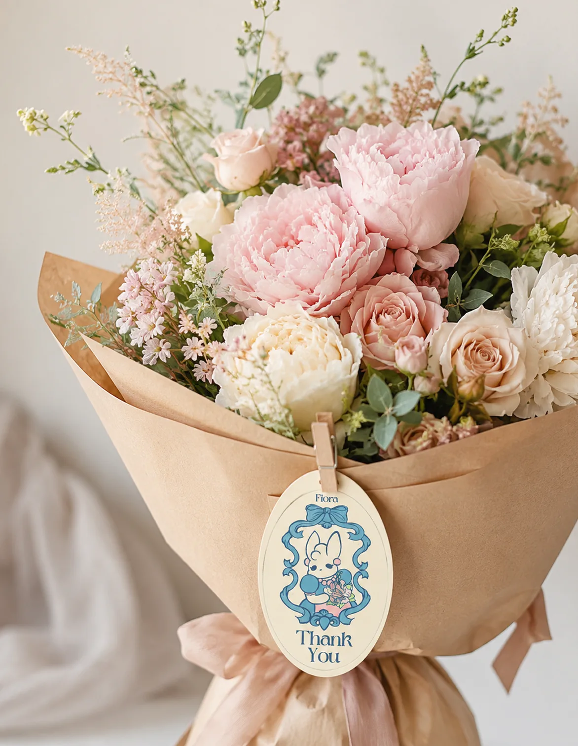
Fiora — Brand Identity (2025)
An elegant brand system with a cohesive visual language across campaign, product, and digital applications.
Services: Brand Identity, Art Direction, Visual Design
Fiora is a lifestyle brand built on quiet elegance — because premium doesn't shout, it stays consistent. We shaped a visual language that holds its composure across campaign imagery, product, and digital: refined typography, a restrained palette, and art direction that lets the product carry the story. Recognizable everywhere, overdone nowhere.
The Problem
In premium lifestyle, inconsistency is what betrays a young brand. Fiora needed a visual language that stays composed everywhere — campaign, product, digital — without depending on any single designer's taste.
The Approach
We treated restraint as strategy: refined typography, a muted palette, and art direction that lets the product carry the story — all codified into rules that survive real production.
The Solution
A cohesive visual language that is recognizable across every application and never overdone. Quiet, consistent, premium — the kind of brand people trust at a higher price.
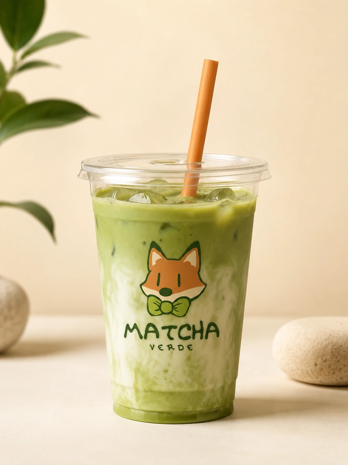
Matcha Verde — Brand Identity (2025)
A warm café and beverage brand with menu, packaging, signage, and sticker applications across physical touchpoints.
Services: Brand Identity, Packaging, Environmental Design
Matcha Verde is a café brand — and cafés live or die by atmosphere. We designed everything a guest touches: logo, menus, cups, packaging, window signage, and stickers, all working as one warm, cohesive world. When every detail agrees, the brand sells as hard as the drinks do — and guests come back with friends.
The Problem
A café sells atmosphere as much as it sells drinks — and guests judge it in seconds, from the window, the cup, the menu. A fragmented look reads as amateur and quietly kills a premium price point.
The Approach
We designed the guest journey touchpoint by touchpoint: window signage, menus, cups, bags, and stickers as one warm, cohesive world, with color and typography drawn from the product itself.
The Solution
A complete café identity where every object is on-brand and photogenic. Cups and bags become advertising that walks out the door — the kind of consistency that turns first visits into habits.
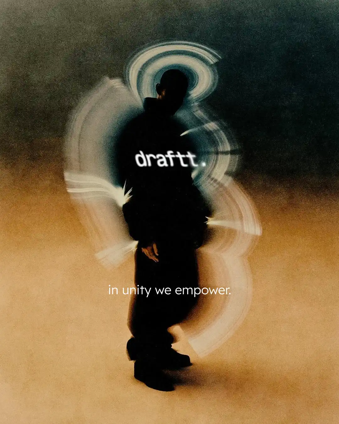
Draftt — Brand Identity (2025)
A bold identity spanning apparel, accessories, and social visuals with a strong monochrome graphic language.
Services: Brand Identity, Art Direction, Creative Systems
Draftt is a fashion label with a bold monochrome attitude — and streetwear is bought by eye, in seconds. We built a graphic system confident enough to live on apparel, accessories, packaging, and social without losing its edge: one mark, one voice, instantly recognizable from a cap embroidery to a feed post. That's what makes a label get picked up off the rack.
The Problem
Streetwear is one of the loudest, most crowded categories in fashion, and most new labels disappear because their identity doesn't survive beyond a logo tee. Draftt needed a graphic language strong enough to be recognized without reading the name.
The Approach
We reduced the brand to its sharpest assets: a bold monogram, strict monochrome, and a confident layout rhythm — then stress-tested the system across apparel, accessories, packaging, and social content.
The Solution
A system where a single 'D' on a cap or a black-and-white post is unmistakably Draftt. One mark, one voice, ready to scale from a first drop to full collections without losing its edge.
Line A — Brand Identity (2025)
A street-led fashion identity with packaging, environmental mockups, and a flexible system for product launches.
Services: Brand Identity, Packaging, Art Direction
Line A is a street-led fashion brand made to compete for attention in the city itself. We designed a flexible identity — logotype, palette, packaging, and environmental applications — sharp enough for a storefront and adaptable enough to carry every drop that follows. Not just a logo: a system built for launches.
The Problem
A street-led fashion brand competes with the visual noise of the city itself. Without a flexible system, every launch means reinventing the design from scratch — slow, expensive, and inconsistent.
The Approach
We built the identity as a kit, not a one-off: logotype, palette, packaging, and environmental applications governed by clear rules, so each new drop deploys fast and still looks unmistakably Line A.
The Solution
A launch-ready system covering everything from cups and bags to street-level placements. The brand stays sharp and consistent while the product line grows — recognition compounds with every release.
Athena — Brand Identity (2025)
A refined beauty and wellness identity with packaging, palette, and touchpoints built for a premium, calm brand presence.
Services: Brand Identity, Packaging, Art Direction
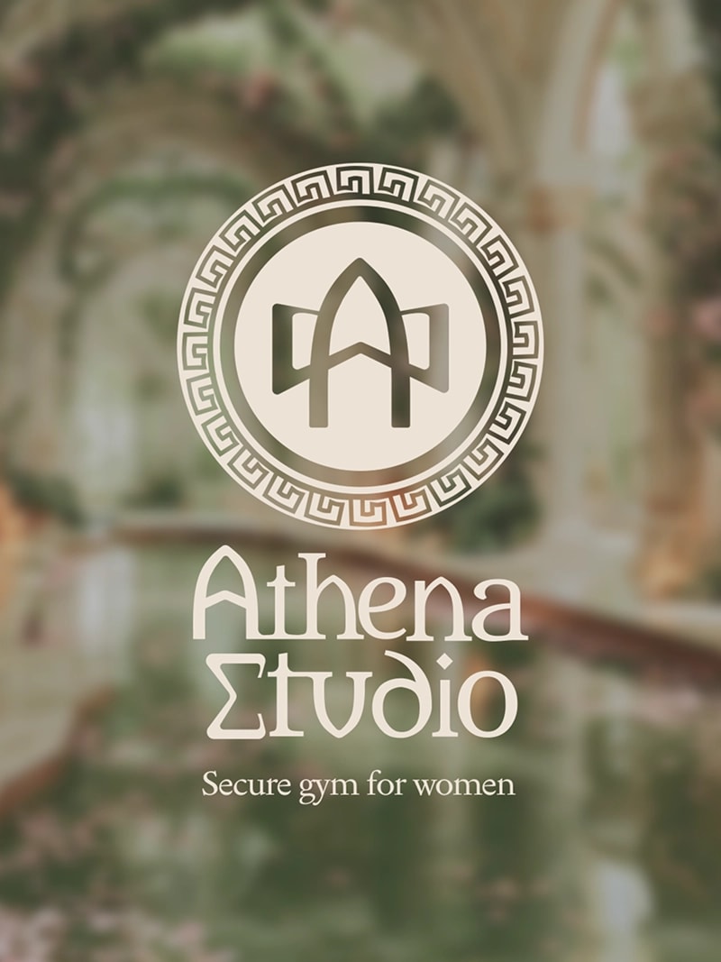
Athena is a women-only fitness studio, and its brand had to promise two things at once: safety and strength. We crafted a calm, premium identity — logotype, palette, membership cards, signage, email templates, and social content — so the studio feels trustworthy and inviting from the street sign to the front desk. The right brand does half the selling before a visitor even walks in.
The Problem
Women don't choose a gym on price alone — they choose on trust. Most fitness branding is loud, aggressive, and interchangeable, which is exactly the wrong signal for a women-only studio. Athena needed an identity that communicates safety, care, and strength before a visitor ever steps inside.
The Approach
We positioned Athena closer to a premium wellness brand than a conventional gym: a calm palette, classical typographic cues, and deliberate restraint. Then we designed around the real decision points — the street sign, the front desk, the membership card, the social profile.
The Solution
A cohesive identity system — logotype, palette, membership cards, signage, email and social templates — that reads premium, feminine, and secure at every touchpoint. The brand reassures first, so the studio can sell second.
Sanaga Yong Chimpanzee Rescue — Brand Identity (2025)
An NGO identity and campaign system communicating conservation through editorial layouts and digital storytelling.
Services: Brand Identity, Web Design, Art Direction
Sanaga-Yong Chimpanzee Rescue protects one of Africa's most vulnerable species — and a cause this important deserves design that moves people to act. We created an identity and campaign system with editorial layouts and digital storytelling that turn attention into empathy, and empathy into support. Design isn't only commercial; done right, it's persuasive where it matters most.
The Problem
Conservation organizations compete for the same attention and the same donations as everyone else — with far smaller budgets. Sanaga-Yong needed materials with the credibility of a large institution and the emotional pull of the cause itself.
The Approach
We built an editorial-first system: photography-led layouts, restrained typography, and digital storytelling that puts the chimpanzees front and center, with the brand as a steady, trustworthy frame.
The Solution
An identity and campaign system that works across web, print, and social with one persuasive voice — designed to turn attention into empathy, and empathy into support.
This Is Me — Brand Identity (2025)
A personal brand and book-led identity exploring softness, narrative, and tactile visual storytelling.
Services: Brand Identity, Art Direction, Editorial Design
This Is Me is a book-led project about softness, memory, and identity. We designed the editorial system — cover, layouts, and an illustration-driven visual language — so the story feels tactile and personal from the very first page. Proof that we don't just make brands look good; we make them feel like something.
The Problem
A personal, narrative project lives or dies by feeling. A generic book layout would have flattened the story — this one needed design that behaves like part of the writing.
The Approach
We developed an illustration-driven visual language with soft typography and deliberate pacing, designing the spreads to follow the emotional arc of the text rather than a fixed grid.
The Solution
A tactile editorial system — cover, layouts, illustration — where the design carries as much feeling as the words. It's the clearest proof of how we work: form always in service of the story.
Vitnastaivaet — Brand Identity (2025)
A product-led identity with packaging, stickers, and mockups for bottles and outdoor accessories.
Services: Brand Identity, Packaging, Art Direction
Vitnastaivaet is a product brand we took from idea to shelf: logotype, label system, packaging, stickers, and merchandise for bottles and outdoor gear. The identity is built to survive real life — legible on a crowded shelf, durable on a backpack, consistent across every product line. Exactly what a growing product brand needs to stand next to the big players.
The Problem
A new product brand has one chance on the shelf — and no budget to waste. Vitnastaivaet needed an identity and packaging system that would hold up in retail conditions and in real outdoor use, across bottles, packs, and merchandise.
The Approach
We designed a durable, production-friendly graphic language: high-legibility labels, a simple color logic, and assets tested on the actual surfaces they live on — bottles, packaging, stickers, backpacks.
The Solution
A complete kit from logotype to packaging to merchandise that reads as one brand across every product line. Shelf-ready, cost-conscious, and built to make a growing brand stand confidently next to bigger players.
Kremlev — Packaging (2025)
A packaging system with refined structure, material contrast, and consistent brand presence across product touchpoints.
Services: Packaging, Brand Identity, Art Direction
Kremlev came to us for packaging that sells before a word is read. We designed a structured system built on material contrast and disciplined typography — a full product range that reads as one premium family, on the shelf and in the hand. Packaging is the one ad every customer ends up holding; it has to be right.
The Problem
On a shelf, a product gets two or three seconds of attention. Kremlev's range needed packaging where every unit sells individually and the full line reads as one premium family — without relying on expensive production tricks.
The Approach
We built the system on structure: material contrast, disciplined typography, and strict layout rules that keep the range coherent and make adding new products effortless.
The Solution
A packaging family of twelve-plus applications that reads premium in the hand and on the shelf. The design does the selling before a word on the label is read.
How we work
01. Discovery
We immerse ourselves in your world — understanding goals, audience, and competitive landscape to uncover the insights that drive great work.
02. Strategy
Armed with research, we define the creative direction. Positioning, messaging, and visual principles become the foundation for everything that follows.
03. Design
Ideas take shape through iterative exploration. We refine concepts collaboratively until the solution feels inevitable — distinct, purposeful, and true.
04. Apply
The identity moves into the real world — packaging, print, digital, and environmental applications — so every touchpoint feels like one brand.
05. Launch
We ensure flawless execution and provide the tools your team needs to maintain excellence long after delivery.
What clients say
They didn't just deliver a logo — they built a system we still use every week. Packaging, social, and print finally feel like one brand. Clients notice before we even explain who we are.
We came for a rebrand and left with clarity. Positioning, visuals, and motion — everything finally matched the quality of our service. The process was sharp and respectful of our time.
Our café looks and feels premium now — from the window to the takeaway cup. Guests photograph the brand without being asked. That alone paid for the project.
Working with Kenes felt like a partnership, not a vendor handoff. They pushed back when it mattered and delivered a brand that stands out in a crowded fashion market.
Months after launch, we still get compliments on the identity. Clean, modern, and emotionally right — exactly what a lifestyle brand needs to charge a premium.
Make your brand visible with us
Branding, packaging, or illustration — tell us about your project. We'll get back to you within 48 hours.
Email: kenesdesign@gmail.com
Case study: Fiora — Brand Identity
Fiora is a lifestyle brand built on quiet elegance — because premium doesn't shout, it stays consistent. We shaped a visual language that holds its composure across campaign imagery, product, and digital: refined typography, a restrained palette, and art direction that lets the product carry the story. Recognizable everywhere, overdone nowhere.
The Problem
In premium lifestyle, inconsistency is what betrays a young brand. Fiora needed a visual language that stays composed everywhere — campaign, product, digital — without depending on any single designer's taste.
The Approach
We treated restraint as strategy: refined typography, a muted palette, and art direction that lets the product carry the story — all codified into rules that survive real production.
The Solution
A cohesive visual language that is recognizable across every application and never overdone. Quiet, consistent, premium — the kind of brand people trust at a higher price.